You have to learn the rules of the game. And then you have to play better than anyone else.
Albert Einstein
5 Essential Layers Every Brand Needs
— 5 Essential Layers Every Brand Needs — 5 Essential Layers Every Brand Needs
Branding, Business, Strategy
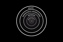
Imagine your brand as an onion, with each layer adding depth and flavor. At its core lies your logotype, its fundamental element. Every layer that surrounds this core will contribute different elements that, if done correctly, will help your brand succeed. Let’s dive into these layers.
1. Logo: The Tip of the Iceberg
Your logo is the visual cornerstone of your brand. It’s the first thing people see and the graphic element they associate with your business. While it’s just the tip of the iceberg, a well-designed logo is fundamental in initiating brand trust.
2. Brand Identity: Colors, Typography, Patterns, and More
Beyond the logo lies the broader spectrum of brand identity. This includes your brand’s colors, typography, patterns, and other visual elements like photography style. These elements work together to create a cohesive and memorable brand image that resonates with your audience.
3. Branding: Shaping Your Brand's Narrative
Branding is the process of crafting your brand’s story and identity. It includes your brand strategy, defining values, voice, personality, target audience, and market positioning. Additionally, branding extends to every touchpoint that shapes the brand experience, from how you communicate with customers to the sensory elements like smell, sight, and touch. Effective branding creates a strong emotional connection with your audience, turning them from customers to fans.
4. Marketing and Advertising: Amplifying Your Brand's Message
Once you’ve established your brand identity and strategy, it’s time to amplify your message through marketing and advertising. This includes strategies like content marketing, social media campaigns, and paid advertising, all aimed at reaching and engaging your target audience.
5. Sales: Converting Leads into Customers
The final layer of the brand-building process is sales. This is where all your branding and marketing efforts culminate in converting leads into customers. If your previous layers are well put together and you have a strong brand, the sales process can become smoother, as customers are already familiar and comfortable with your brand.
To finish this article, I’d like to point out the most crucial element, which I seem to have forgoten to mention: your product or service. While these 5 layers can help you attract more clients and build brand trust, if your offering isn’t top-notch, you might make a sale once, but that’s where it ends.
In conclusion, building a successful brand requires attention to each of these layers. From logo to marketing, to sales, each layer plays a crucial role in shaping your brand’s story and connecting with your audience. The more attention to detail and professionalism applied to each layer, the greater your brand’s chance of success.
What other aspects of brand management are you curious about?
Schedule a free discovery call today, and let’s talk about your business!
You have to learn the rules of the game. And then you have to play better than anyone else.
Albert Einstein
The X-Factor in Branding: Your Brand Strategy
— The X-Factor in Branding: Your Brand Strategy — The X-Factor in Branding: Your Brand Strategy
Branding, Business, Strategy
When designing a brand identity, initiating the process with a brand strategy provides a clear path to develop the brand. It offers insights into color choices, helps determine the best typography to convey the brand’s personality, and guides the development of its copywriting, among other crucial elements. This strategy later serves as a guideline for the business to understand clearly how they could construct their communication, structure their marketing, and manage their brand.
Creating a brand strategy takes time for research and analysis, increasing the cost of a branding project. However, it is a must-have for brands that want to do things right from the start.
So what is a brand strategy?
It is a guideline that defines how your brand will establish its character, connect with its target audience, and differentiate itself in its market. A brand strategy lays the foundation for your brand identity. It includes elements like:
It is a guideline that defines how your brand will establish its character, connect with its target audience, and differentiate itself in its market. A brand strategy lays the foundation for your brand identity. It includes elements like:
Brand Purpose
Why does your brand exist? Brand purpose is the underlying reason for a brand’s existence beyond just making a profit: making a positive impact on society, addressing a higher goal, or contributing to a cause. It focuses on the positive influence your brand will have in the world.
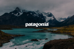
Take for example a brand like Patagonia. Its purpose goes beyond selling outdoor clothing and gear. The company is known for its commitment to sustainability and social responsibility. Patagonia actively works to reduce its environmental impact, promotes fair labor practices, and donates a percentage of its profits to environmental causes. Additionally, they encourage their workers to go outside and enjoy nature, fostering a connection between their employees and the values they uphold.
Brand Voice
The ‘tone & voice’ of a brand refer to the consistent style and manner in which a brand communicates its messages. The tone represents the emotional expression in the brand’s communication: friendly, formal, playful, while the voice is the distinctive way in which a brand speaks: conversational, informative, humorous, or serious.
Think about Nike, and how its brand is characterized by a motivational and empowering tone. The company communicates with a bold and inspirational voice, encouraging individuals to push their limits and strive for greatness. Their communication often features strong, dynamic language that revolves around concepts of sportsmanship, determination, and achievement.

Brand Values
Brand values are the fundamental beliefs and principles that guide a brand’s decisions and interactions. They represent the core ideals and ethical standards that a brand adheres to, shaping its identity and influencing how it engages with its audience and market.
Apple is known for several core values that shape its brand identity. Starting with “Innovation”, Apple strives to create cutting-edge products that set trends in technology. Then we might add “Simplicity” for their user-friendly designs and intuitive interfaces. And include “Design Excellence”, since the brand places a high value on design aesthetics and aims for an incredible visual appeal in their products.

Brand Story
A brand story is a narrative that includes the essence of a brand, its history, values, and purpose, often mixing together elements of the brand’s journey, mission, and unique characteristics to create a memorable and engaging account that will be remembered by your audience.
The Airbnb brand’s story is one of connection and the feeling of being at home. The company started with the idea of creating a network of hosts and travelers who shared a love for travel, by offering a platform for individuals to rent their homes. Airbnb fosters a sense of community and cultural exchange.

When creating a brand identity, initiating the process with a well-defined brand strategy provides a clear roadmap, ensuring your brand’s direction aligns seamlessly with all its elements.
Schedule a free discovery call today, and let’s talk about your business!
You have to learn the rules of the game. And then you have to play better than anyone else.
Albert Einstein
Shades of Success: Color Psychology in Brand Identity
— Shades of Success: Color Psychology in Brand Identity — Shades of Success: Color Psychology in Brand Identity
Branding, Business, Strategy
Exploring The Subconscious Influence of Color in Branding
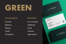
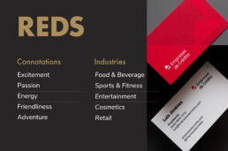
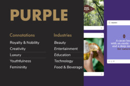
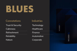
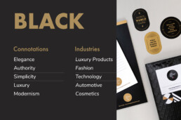
Color is one of the most important elements in branding. Colors mean different things to different people, playing an important role in shaping every brand’s identity and influencing how your business will be perceived in the future. A deep red, for instance, may not feel as sophisticated as a dark black, and a navy blue will never be as friendly and cheerful as a sunny yellow.
However, it’s crucial to consider the cultural context of your brand when choosing colors. Take red, for example: in Western cultures, it’s often linked to passion, love, and danger, whereas in Chinese culture, it represents good luck, happiness, and prosperity.
Imagine if iconic brands swapped their signature colors – Coca-Cola in green would just feel off, and Apple wouldn’t have the same sleek appeal in neon hues.
Established brands often lean on color traditions within their industry. Consider McDonald’s with its iconic red and yellow theme, a color combination that’s become synonymous with fast food worldwide. But then there’s Starbucks, boldly breaking the mold with its signature green, a stark contrast to the typical browns and blacks of traditional coffee shops. The choice to blend in or stand out with your color palette isn’t a matter of right or wrong. It’s a strategic decision, a crucial piece of the branding puzzle that needs careful consideration right from the start.
In my opinion, picking the right colors for a brand is super underrated. It’s tough, really tough. Even for pro brand designers, getting those colors just right is a bit of a juggling act. And if you’re new to this? Well, you’re probably going to spill the milk a few times before you get it right. Do designers and brand owners really sweat over this stuff as much as they should? They definitely ought to, because a brand’s color palette can make or break a brand.
Taking some advice from Gary Vaynerchuk’s book ‘Jab, Jab, Jab, Right Hook’, it’s all about giving your audience valuable information. As he says, ‘Give value. Give value. Give value. And then ask for business.’ So, here’s my two cents on how colors work in different industries and their meanings in society’s collective perception. When picking your brand’s colors, choose to go with a color palette that’s similar to other businesses within your niche, or choose a different route altogether, but choose wisely—your colors are a big part of your brand’s story.
<strong><a href=”https://www.designetiquette.com/book-a-call/”>Schedule a free discovery call today, and let’s talk about your business!</a></strong>
You have to learn the rules of the game. And then you have to play better than anyone else.
Albert Einstein
The Death of Print: Myth or Reality?
— The Death of Print: Myth or Reality? — The Death of Print: Myth or Reality?
Branding, Business, Creativity
Is Print Really Dead?
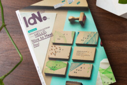
A couple of months ago I was contacted by Idn Magazine, a design publication from Hong Kong. Their upcoming edition talks about brand identity, and more specifically business cards. I was thrilled to learn they wanted to feature our projects in their new edition and asked for my insights on the relevance of printed materials today. This email made my month and triggered a safari of ideas in my head.
“Print is dead!”. That’s what haters will say. For UI/UX designers and some business owners, printed materials have been dead for the past twenty years when social media started killing marketing and advertising as we knew it.
Twenty years sounds like a lot of time, but in retrospect, time can flow like water through your fingers, making two decades feel like yesterday. Social media and Web 2.0 transformed life in unimaginable ways, especially for a millennial like me, who has lived half in analog and half in digital, making me feel like I was born either too late or too early.
We millennials have lived a part of our lives with bicycles, cinemas, VHS, MTV, and uncensored bullying, which have been gradually replaced by smartphones, Netflix, Spotify, Uber, and fourth-place trophies.
Before social media, print was a thing: For breakfast, we didn’t scroll through our Facebook feed, we read the back of our cereal box or the newspaper. Cluttered catalogs have turned into e-commerce, and we’ve exchanged random flyers in the mail for hyper-targeted Meta ads. Thanks to social media and digital marketing, you can now connect with people around the clock, with a purpose and in a targeted way. The tables have turned making digital communication the new normal.
If you look around your house right now, chances are you won’t be able to find a flyer, coupon, business card, or brochure. Most of our books are digital. We take thousands of photos but only print one percent of them. Is print really dead?
My take on this is complex, and my opinion may not be popular. Right now I would compare print to one of Sookie Stackhouse’s lovers: a vampire that has been half-dead for the past ten years but is still handsome, elegant, clever, and thriving. It can sometimes look outdated and even creepy, but it can also be a beautiful rarity that can still hypnotize your customers. After all, we only print the best photos, buy the physical books when they are good enough for our library, and give out our spot-gloss business cards only to very important people.
Yes, digital is the new normal, but it is also saturated, much like printed communication was twenty years ago. Going old-school by printing a flyer for your business or sharing your brand story on the back of your packaging offers a golden opportunity worth exploiting. Today a well-designed packaging, brochure, or business card is a sexy vampire waiting to use its fangs on whoever has eyes to see.
You have to learn the rules of the game. And then you have to play better than anyone else.
Albert Einstein
Our Work Featured in IdN World Magazine
— Our Work Featured in IdN World Magazine — Our Work Featured in IdN World Magazine
Publications
Print is not dead!
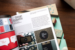
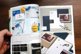
We’re thrilled to announce that our work has been showcased in the latest edition of IdN World Magazine (v28n4) all the way from Hong Kong!
This edition focuses on brand identity and business card design, featuring the outstanding work of talented designers and studios, as well as their points of view about business cards and print materials nowadays. We’re truly honored to be featured among them!
“Printed materials are still as important today, if not more so, than they were years ago. Now that everything is digital, there is less competition in printed communication, which creates an opportunity for brands to capture the attention of their customers every time they see their printed materials. A well-designed business card, brochure or flyer can be a reminder of your brand outside of the increasingly competitive digital matrix.“Printed materials are still as important today, if not more so, than they were years ago. Now that everything is digital, there is less competition in printed communication, which creates an opportunity for brands to capture the attention of their customers every time they see their printed materials. A well-designed business card, brochure or flyer can be a reminder of your brand outside of the increasingly competitive digital matrix.” —Mariana Pacheco
You can get a copy of the magazine here. and check out the online article here.
You have to learn the rules of the game. And then you have to play better than anyone else.
Albert Einstein
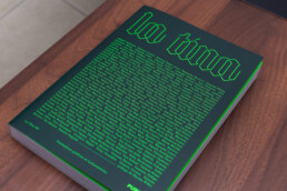
Our Work Featured in La Tina
— Our Work Featured in La Tina — Our Work Featured in La Tina
Publications
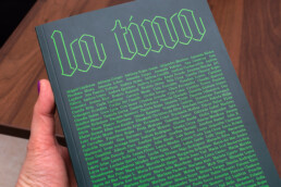
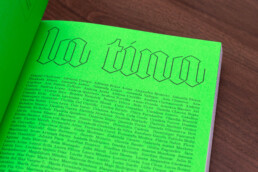
Celebrating 175 Inspiring Latin American Female Designers.
La Tina showcases the exceptional work of talented women designers from across Latin America, including our director, Mariana Pacheco. It is an honor to have our work alongside so many talented women.
Thank you Pupila for this amazing book and for celebrating design in our region.
You have to learn the rules of the game. And then you have to play better than anyone else.
Albert Einstein
Your Brand and Social Media
— Your Brand and Social Media — Your Brand and Social Media
Business, Marketing, Branding
The world we live in today is more connected than ever before, and social media (and a freaking pandemic) has played a big role in this.
With that said, having a good social media presence, and improving your digital marketing, can bring many advantages to your business:
Increased brand awareness and recognition:
Social media platforms allow you to reach a large and diverse audience cost-effectively. By consistently posting engaging content and interacting with your followers, you can build a strong online presence that can help attract new customers and retain existing ones.
Lead and sales generation:
With platforms like Instagram, Twitter, and TikTok, you have a direct line of communication with your target audience, making it easy to promote your products or services, as well as generate leads by directing potential customers to landing pages or sign-up forms.
Better customer service and engagement:
They help you provide customer service in a quick, easy, and personal way. It allows you to respond to customer complaints and issues quickly and efficiently, which can help improve customer satisfaction.
Market and customer research:
Improving your digital marketing and social media channels, allow your business to gather valuable data and insights about your users. Most platforms’ analytic tools can track engagement, demographics, and other insights that will help you understand your audience. This data can be used to optimize marketing strategies and improve your brand experience.
Cost-effective advertising:
Social media platforms offer cost-effective advertising options for businesses, allowing you to reach your target audience with precision, by targeting your customer’s demographics and interests.
Create a community:
Building relationships with customers on social media can help increase brand loyalty and customer retention. In today’s highly competitive market, customers are no longer solely motivated by product offerings and pricing. They are looking for deeper connections with brands and a sense of belonging to a like-minded community.
Leadership and customers’ top of mind:
These platforms allow brands to share their stories, expertise, and insights, positioning themselves as thought leaders in their market. Regularly posting valuable content can keep your business on your customers’ top of mind and build brand trust.
“If they haven’t posted in a while, I simply do not contact them”. That’s what one of my friends casually said at a party. I’m ending this article with that insightful quote because it illustrates greatly the way people perceive and interact with brands on social media, and how maintaining a consistent and active presence on these platforms can impact the success of a brand.
We can help your business thrive. Schedule a free discovery call today, and let’s talk!
You have to learn the rules of the game. And then you have to play better than anyone else.
Albert Einstein
Our Work Featured in Logo Lounge 13
— Our Work in Logo Lounge 13 — Our Work in Logo Lounge 13
Creativity, Publications
We are so excited to have one of our logos chosen for this year’s Logo Lounge 13.
With 36,000 submissions and only 3,000 logos chosen, this book’s packed with incredible logo designs from around the world. Logo Lounge has been a source of inspiration for our work throughout the years, and we couldn’t be more honored to have our work in it.
You have to learn the rules of the game. And then you have to play better than anyone else.
Albert Einstein
Your logo. Your flag.
— Your logo. Your flag. — Your logo. Your flag.
Creativity, Brand Strategy
I can’t remember how often clients have asked us to design a logo representing their brand values, history, niche, customers, believes, and strategy. Wait! What? No.
First, let’s start with the definition and function of a logo: A logo is a graphic element, symbol, or emblem used to identify a company, organization, or brand.
Is it possible to enclose all your brand information in this simple graphic? The answer is no. Instead, I try to explain to our clients that they should think of their logo as a country’s flag. And let me explain this analogy:
Pick a country, any country. Say, Costa Rica. Its flag has a simple blue, white and red stripe combo (similar to Thailand’s, but inverted). If you’ve never seen our flag, you won’t know what you are looking at. But if you have, you probably have an image associated with it: Nature, “Pura Vida”, Coffee, Keylor Navas, Gallo Pinto, Peace. All your associations go hand in hand with your life experiences and personal preferences.
The same thing happens with your logo. When people first see it, they are just going to see graphic elements (whether simple or complex, monochromatic or colorful). As people start interacting with your business, your logo takes on new meanings: great brand, good service, interesting company values, inspiring brand story. Your brand identity and marketing can give your customers an idea of what to expect from your product or service, but your logo alone, which is probably the first thing they interact with, can’t. If your business was a country, your logo is its flag.
Your secretary yelled at your client? Does your latest flavored frappuccino taste like kombucha? Did your flight attendant kick a passenger out of their flight? Many big brands have had a customer experience gone so bad and viral, that they’ve turned their logos into the equivalent of House Bolton’s sigil, making everyone run in the opposite direction when they see it. If you are not on top of your game, your logo could start having negative connotations: lousy customer service, cheap products, and unacceptable business policies. This is why it’s important to craft every aspect of your brand so that, in time, the associations that people have when seeing your logo, are good. Hopefully great.
So start thinking about your logo as your business flag, and start analyzing the associations people have about your brand when they see it. By doing this, you’ll find ways to improve your business and help your customers better. Your brand value, after all, is what they make of it.
You have to learn the rules of the game. And then you have to play better than anyone else.
Albert Einstein
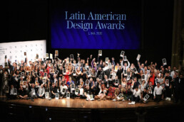
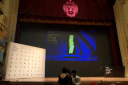
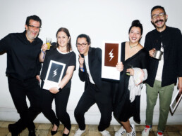
We won a silver LAD Awards
— We won a silver LAD Awards — We won a silver LAD Awards
Awards, Publications
We are excited to announce that Design Etiquette has won a silver award at the Latin American Design Awards, the most important design competition in Latin America!
The LAD Awards celebrates the best of design from around the region with some of the biggest studios awarded. The jury is made up of leading designers in their field. We strive to be excellent at our craft, delivering high-end design solutions for our clients, and it is an honor for us to be recognized among our peers and alongside other studios, we respect and admire. This award will inspire us to continue pushing the boundaries and help make the world a better place with design.