You have to learn the rules of the game. And then you have to play better than anyone else.
Albert Einstein
The Death of Print: Myth or Reality?
— The Death of Print: Myth or Reality? — The Death of Print: Myth or Reality?
Branding, Business, Creativity
Is Print Really Dead?
A couple of months ago I was contacted by Idn Magazine, a design publication from Hong Kong. Their upcoming edition talks about brand identity, and more specifically business cards. I was thrilled to learn they wanted to feature our projects in their new edition and asked for my insights on the relevance of printed materials today. This email made my month and triggered a safari of ideas in my head.
“Print is dead!”. That’s what haters will say. For UI/UX designers and some business owners, printed materials have been dead for the past twenty years when social media started killing marketing and advertising as we knew it.
Twenty years sounds like a lot of time, but in retrospect, time can flow like water through your fingers, making two decades feel like yesterday. Social media and Web 2.0 transformed life in unimaginable ways, especially for a millennial like me, who has lived half in analog and half in digital, making me feel like I was born either too late or too early.
We millennials have lived a part of our lives with bicycles, cinemas, VHS, MTV, and uncensored bullying, which have been gradually replaced by smartphones, Netflix, Spotify, Uber, and fourth-place trophies.
Before social media, print was a thing: For breakfast, we didn’t scroll through our Facebook feed, we read the back of our cereal box or the newspaper. Cluttered catalogs have turned into e-commerce, and we’ve exchanged random flyers in the mail for hyper-targeted Meta ads. Thanks to social media and digital marketing, you can now connect with people around the clock, with a purpose and in a targeted way. The tables have turned making digital communication the new normal.
If you look around your house right now, chances are you won’t be able to find a flyer, coupon, business card, or brochure. Most of our books are digital. We take thousands of photos but only print one percent of them. Is print really dead?
My take on this is complex, and my opinion may not be popular. Right now I would compare print to one of Sookie Stackhouse’s lovers: a vampire that has been half-dead for the past ten years but is still handsome, elegant, clever, and thriving. It can sometimes look outdated and even creepy, but it can also be a beautiful rarity that can still hypnotize your customers. After all, we only print the best photos, buy the physical books when they are good enough for our library, and give out our spot-gloss business cards only to very important people.
Yes, digital is the new normal, but it is also saturated, much like printed communication was twenty years ago. Going old-school by printing a flyer for your business or sharing your brand story on the back of your packaging offers a golden opportunity worth exploiting. Today a well-designed packaging, brochure, or business card is a sexy vampire waiting to use its fangs on whoever has eyes to see.
You have to learn the rules of the game. And then you have to play better than anyone else.
Albert Einstein
Why Design Etiquette?
— Why Design Etiquette? — Why Design Etiquette?
Creativity, Brand Strategy
The french word etiquette refers to conventional forms and codes of conduct.
Whatchamacallit? That’s the most common question clients ask me when they are starting a new business and don’t know what to call it. This identity dilemma is like being pregnant and searching a thousand ugly websites for baby names, while nervously thinking about your name choice and how it will affect your son or daughter’s future. It’s worse if you’re looking for a brand name, because in the case of a brand, you cannot just call it John, or Paul, or Ringo, or George… Your brand’s name should be strategic in so many ways (that I will discuss in another post).
In 2009, when I decided to go bossless, I learned that in the realm of branding, this specific service is called “Naming”, and people pay Lannister gold for it. Since this was my first time as an entrepreneur and I didn’t have the money, I baptized my design studio.
I wanted a name that was unique and easy to understand no matter where you were in the world. I also wanted the name to be a reference to the clean and elegant designs that I wanted to create for my clients.
Design Etiquette: People either hate or love my name choice. There seems to be no middle ground for it, and according to “Hello, My Name is Awesome”, by Alexandra Watking, it’s not the best name either: it is hard to understand, hard to write, and for a lot of people (Siri included) hard to pronounce.
Maybe, it is a name that provokes a lot of mixed feelings because it is controversial: the french word etiquette, refers to conventional forms and codes of conduct, established conventions and good taste. This is when some people start asking themselves: Should design have dos and don’ts? Is there such a thing as creative decorum? I myself, think so.
In my early years as a designer I was led to believe that design was a divine talent granted to a few lucky hipsters. A wild spirit animal that you were either born with or not. In a sense, it was insinuated that colors, typography, patterns and graphic choices came from my intuition, not my knowledge or skills.
While studying a Master in Visual Design in Milan, Italy, I was relieved and delighted to learn that Italians treat design as a science, everything has to be in place, everything has to have an explanation. For them, design is methodical. Even though they are not as strict as the Swiss, Italians respect and take pride in their craftsmanship, and most of them —from a designer, to a chef, all the way to a barista— care about the little details of their occupation just like a good old artisan would. As much as they believe in the muse of creativity, they also know that in order to be good at what you do, you have to evolve your skills and learn from your superiors.
CREATIVITY WITHOUT STRATEGY, CONCEPTUALIZATION, AND EDUCATION IS JUST DULL.
The best designs, products, and buildings are created when creativity meets intention, talent, skills and strategy. Coming up with an idea just because –more often than not— is not enough, and going the extra mile, whether in education, precision, style or passion, is what makes a piece of wood an Eames, some concrete blocks a Zaha Hadid, and random letters a Jessica Heische. Even James Victore’s work, including his “Feck Perfuction”, contains a full dose of strategy, talent and passion.
So, if you ask me, design should have etiquette. There needs to be a balance between the magical side of creativity and the methodical side of our right-brained occupation. By doing so, I believe we’ll improve our craft, and increase the value and quality of our work.
Schedule a free discovery call today, and let’s talk about your business!
You have to learn the rules of the game. And then you have to play better than anyone else.
Albert Einstein
Not Just a Label
— Not Just a Label — Not Just a Label
Creativity, Packaging Design
How the design of a bottle label changed the history of Iceland’s most iconic drink.
Some years ago I met a group of friendly, and good looking, people from Iceland. They bragged about their pure water resources, wild horses, volcanoes, and beautiful country, while I bragged about Costa Rica’s nature, wild monkeys, volcanoes, and beautiful country. During our time together we shared and compared different parts of our culture: photos, believes, legends, food and drinks. Conversations turned into a passionate fight of Tuleviejas vs Trolls, Gallo Pinto vs Hakarl, and Guaro vs Brennivin.
Brennivin, that’s the name of Iceland’s famous drink, a liquor made out of potato and caraway (and don’t ask me what caraway is) that contains 37.5% alcohol, therefore its nickname “Black Death”. Design legend has it that around 1935 the government tried to make the bottle label less appealing in order to dissuade Icelanders from consuming alcohol. Their new black and white redesign caused the total opposite: sales skyrocket and, to this day, the drink with its beautiful and simple label still gives people the worst hangovers.
As a passionate designer, I kept the bottle as a souvenir of the great time I had, and as a reminder of the power that design has over a product, brand, and even the collective conscience of a country.
Cheers to good design and delicious Brennivin!
You have to learn the rules of the game. And then you have to play better than anyone else.
Albert Einstein
Our Work in PencilCase
— Our Work in PencilCase — Our Work in PencilCase
Publications
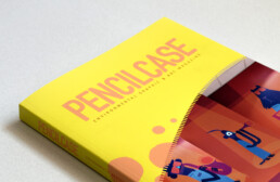
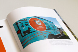
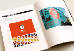
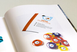
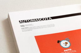
ME publishing included our branding project for Auto Mascota in their magazine PencilCase.
We thank them for publishing our work and sending us a copy all the way from Seoul, Korea.
PencilCase is a magazine packed with amazing branding and environmental graphic design projects.
You have to learn the rules of the game. And then you have to play better than anyone else.
Albert Einstein
Our Business Cards in FPO
— Our Business Cards in FPO — Our Business Cards in FPO
Publications
FPO: For Print Only is a division of the popular design blog and studio Under Consideration.
FPO is a blog that launched in 2009 which features the beauty and development in production of printed materials. It’s a great resource for designers and business owners because it showcases different print projects that use a multiple of diverse printing technique.
Projects like annual reports, books, business cards, stationary, posters, packaging, and anything else that’s printed are showcased.
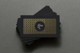
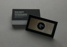
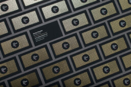
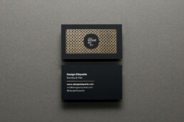
We are happy to have our business cards featured in their site this month! We printed them with the help of Moo Cards and we are very happy with the end product.