Fantastic to work with. Mariana and her team were fantastic to work with. Responsive, understanding, and organized. Most importantly the quality of the work is exceptional. I am tremendously proud to be represented by the branding that Design Etiquette created for my business.
Brandon Chillingworth — Hacked BD
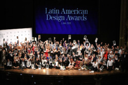
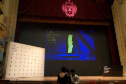
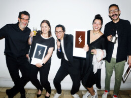
We won a silver LAD Awards
— We won a silver LAD Awards — We won a silver LAD Awards
Awards, Publications
We are excited to announce that Design Etiquette has won a silver award at the Latin American Design Awards, the most important design competition in Latin America!
The LAD Awards celebrates the best of design from around the region with some of the biggest studios awarded. The jury is made up of leading designers in their field. We strive to be excellent at our craft, delivering high-end design solutions for our clients, and it is an honor for us to be recognized among our peers and alongside other studios, we respect and admire. This award will inspire us to continue pushing the boundaries and help make the world a better place with design.
Fantastic to work with. Mariana and her team were fantastic to work with. Responsive, understanding, and organized. Most importantly the quality of the work is exceptional. I am tremendously proud to be represented by the branding that Design Etiquette created for my business.
Brandon Chillingworth — Hacked BD
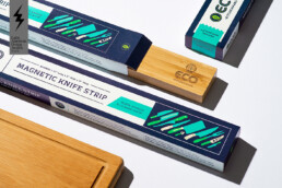
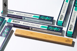
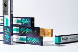
Not Just a Label
— Not Just a Label — Not Just a Label
Creativity, Packaging Design
How the design of a bottle label changed the history of Iceland’s most iconic drink.
Some years ago I met a group of friendly, and good looking, people from Iceland. They bragged about their pure water resources, wild horses, volcanoes, and beautiful country, while I bragged about Costa Rica’s nature, wild monkeys, volcanoes, and beautiful country. During our time together we shared and compared different parts of our culture: photos, believes, legends, food and drinks. Conversations turned into a passionate fight of Tuleviejas vs Trolls, Gallo Pinto vs Hakarl, and Guaro vs Brennivin.
Brennivin, that’s the name of Iceland’s famous drink, a liquor made out of potato and caraway (and don’t ask me what caraway is) that contains 37.5% alcohol, therefore its nickname “Black Death”. Design legend has it that around 1935 the government tried to make the bottle label less appealing in order to dissuade Icelanders from consuming alcohol. Their new black and white redesign caused the total opposite: sales skyrocket and, to this day, the drink with its beautiful and simple label still gives people the worst hangovers.
As a passionate designer, I kept the bottle as a souvenir of the great time I had, and as a reminder of the power that design has over a product, brand, and even the collective conscience of a country.
Cheers to good design and delicious Brennivin!