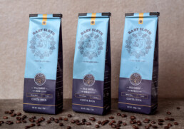
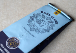
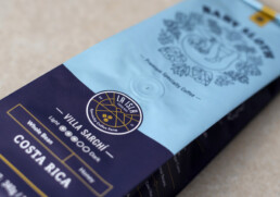
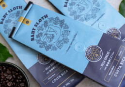
Packaging design featuring Costa Rica’s cutest baby.
Brief:
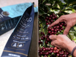
La Isla is a traditional, family-owned specialty coffee farm in the mountains of Costa Rica. They do things differently to not only make the best coffee but also leave the lowest impact on the environment. They’re committed to protecting the natural environment by using less water and harmful pesticides.
La Isla asked us to design their packaging to help promote their brand to an international audience. The packaging needed to be appealing to a wide audience and also needed to speak about its Costa Rican roots and character.
Our Process:
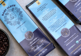
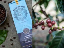
We started by adopting the sloth as a central moniker for the packaging. The sloth is a national icon of Costa Rica and it’s widely loved by all. This would help represent La Isla as a truly Costa Rican brand. We kept the design clean with a linear illustration style and bold colors. The result was a modern and clean look that set the packaging apart on the shelf from other brands that use a more traditional approach.
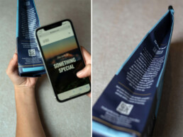
On the side of the packaging, we provided more in-depth detailed information about the farm and its environmental practices. These included its location as well as instructions on how to brew the coffee to best extract its rich flavor profile. In addition, we added a QR code that directed users directly to their website where they could learn more about the farm, its history, and their coffee.
Client: La Isla Services: Packaging Design Website: laislacr.com
