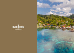
A boutique hotel on the island of Roatán, Honduras.
Brief:
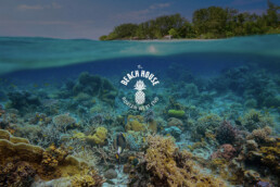
After renovating the hotel, The Beach House asked us to redesign and update the logo to give it a fresh and contemporary feel. They wanted to retain the pineapple icon as it is a symbol of hospitality in the region. This would also help maintain a sense of familiarity for the hotel and its clients.
Our Process:
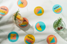
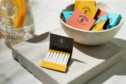
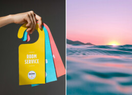
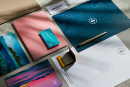
We started by updating the typography and chose a clean, modern, sans serif font. We also modernized and stylized the pineapple, making it more iconographic and interesting to look at. For the primary logo we created a main badge, which would then be adapted into a series of badges for various different communications and uses. This helped create a unified and consistent theme whilst adding variety to the brand.
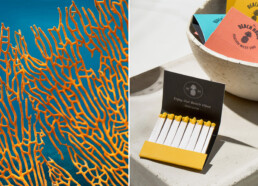
Lastly, for the brand’s color palette we took inspiration from the buildings of Roatán itself. We selected a palette of bright, pastel colors to give the brand a relaxed and inviting feel, like every good beach hotel should have. The overall effect was an updated logo and brand that was as inviting as the hotel itself.
Client: The Beach House Services: Brand Identity Redesign